April 6, 2017 anaylsis politics
Like many, I find myself still pondering this election. While I’ve accepted that I’ll never fully know why Trump won, I’ve remained interested in how he won. As an engineer, I decided to tackle this question the only way I know how - by looking at the data. I chose to examine the election results and registration statistics from Pennsylvania as a small, tractable case study, that’s still interesting as a swing state and might be representative of larger trends.
The data bares two insights. First, this election is remarkable, not because Trump won, but because of how he won. In fact, Trump and his team had to do a lot of things well to pull out a win in Pennsylvania. Trump outperformed Mitt Romney (the Republican presidential candidate in 2012) by a wider margin than Obama did over his predecessor (Kerry) in 2008. That is, Trump swung more votes in 2016 than Obama did in 2008.
Second, that a Republican won Pennsylvania this year is only remarkable when compared to Obama’s win in 2008. We often look at the 2008 election as the obvious comparison for this election, forgetting what a remarkable election that was itself. It turns out that when we look at the surrounding presidential elections, we see that 2016 was NOT an anomaly, but 2008 was.
I have broken my analysis and results into two parts. The first part (the remainder of this post) focuses on the 2016 results and how Trump won, while the second part examines previous elections, highlighting different trends that help put this election into context.
Part One: How Trump Won
I was surprised to see just how much he improved over Romney to pull out this win. Nevertheless, this was a close race. Trump won the popular vote by a mere 44,292 votes (less than 1% of all votes cast). In contrast, Obama won Pennsylvania in 2012 by 312,501 votes (5.45%) and by 620,319 votes (10.33%) in 2008. And yet, if you look at the map of election results by county presented in Figure 1, you would be forgiven for wondering how the election was so close, given how many counties are red (Trump won 56 counties to Clinton’s 11).
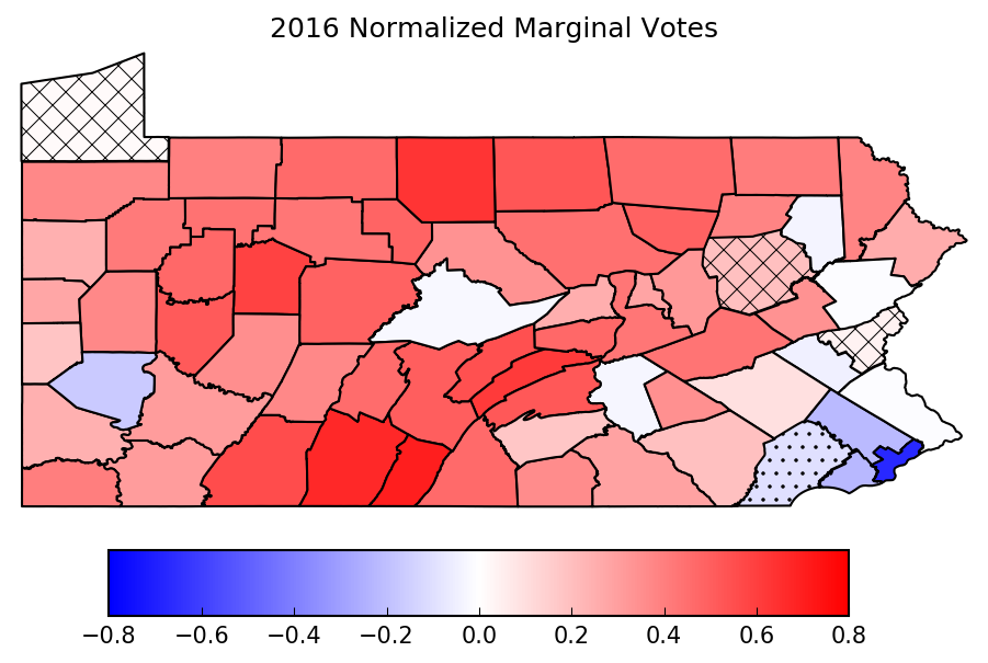
Fig 1. Map of 2016 election results by county. Counties are colored according to their normalized marginal votes. Cross-hatches indicate counties which Obama won in ‘12 that ‘flipped’ to Trump in ‘16. Dot-hatches indicate the reverse (Romney -> Clinton).
The problem with this map is that it obscures the effect of the absolute magnitude of the results across counties. Because Pennsylvania (like most states) decides its electoral college by popular vote across the entire state, it’s the total number of votes each candidate receives that matters, not how many counties they win. Many of the counties which Trump won have dramatically smaller populations, and thus contribute less towards the popular vote. Indeed, in 2016, Philadelphia county cast 707,631 votes, which comprised more votes cast than the 35 smallest counties combined (more than half of Pennsylvania’s 67 counties!).
Figure 2 attempts to better illustrate the impact different counties have on each candidate’s overall outcome, by stacking the marginal votes for each candidate side-by-side.
Nomenclature: Throughout this post, I will refer to the marginal votes of a county. This is simply the difference between votes cast for the Republican and the Democrat candidates. By convention, this value is positive when the Republican gained more votes. Oftentimes, as in Figure 1, it is useful to normalize the marginal votes for each county, dividing by the total number of votes cast in that county in that election; I will refer to this as normalized marginal votes.
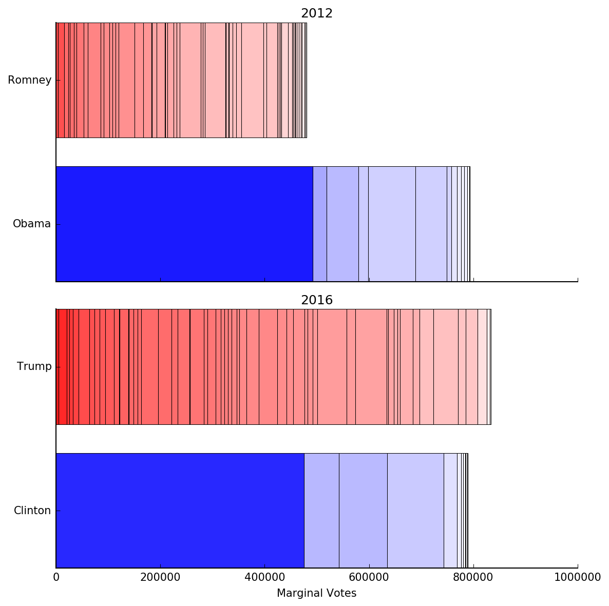
Fig 2. Stacked bar chart of county marginal votes in 2012 (top) and 2016 (bottom), grouped by winning candidate in that county. Each bar-section is a county, with width equal to the marginal votes and colored according to normalized marginal votes (same as in Fig 1). Sections within each stack are ordered by normalized marginal votes.
Now that we’re reflecting the absolute impact of each county, the race appears much closer. Note how clearly this figure illustrates the outsized influence Philadelphia county has, which appears as the largest blue bar. Also note how Clinton won the lion’s share of her marginal votes from just 4 counties, while Trump’s marginal votes were more evenly distributed across the majority of the counties he won.
Most importantly, notice how the two elections compare. While Clinton garnered nearly as many marginal votes as Obama did in ‘12 (she was short by 3,728 votes), Trump earned 73.5% more than Romney (Trump gained 353,065 additional votes), and 40,564 more than Obama did in ‘12. And Trump won these additional votes from nearly the same counties as Romney (only a net of 2 counties flipped Republican from ‘12 to ‘16, as Figure 1 showed). To put that in perspective, in 2008 Obama earned only 45.2% more marginal votes than Kerry did in ‘04 (291,836 additional marginal votes) and flipped a net of 6 counties.
In this respect, Trump was able to swing more votes (when compared to his predecessor) than Obama did in 2008. This is a remarkable fact. I wanted to know where these votes came from - how did Trump achieve this feat? To better understand this, I examined various theories. These are presented next. For each theory, I discuss what I found in the data to support or refute it, and postulate how many of Trump’s additional 353,065 marginal votes it could explain. All comparisons are with 2012 results.
Republicans had Increased Representation
Probably the most credible theory is that Republican voters had a larger presence in this election. This would be achieved through two different mechanisms. They could have turned out to vote in higher numbers (relative to Democrats) than in previous years. We would also see a higher Republican representation in the results if the relative number of registered Republican voters increased since 2012.
We can’t directly determine turnout rates by party without looking at exit poll data, which I don’t have access to. However, we can compute overall turnout for each county (as total votes cast over total registered voters1) for each election year. Figure 3 shows how overall turnout changed from 2012 to 2016. From this, we can see that in counties where Trump won the turnout was on average (the red line in the boxplots) about 3% higher than those where Clinton won. In all, there was a net increase of 381,380 votes cast across the state in 2016.
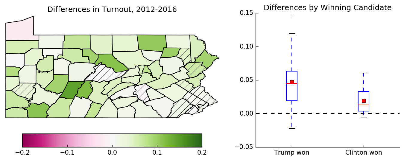
Fig 3. Map (left) and Tukey boxplots (right) of the distribution of the difference in turnout (2016-2012) in each county. The hatched counties on the map are the counties which Clinton won in 2016. For the boxplots, the counties are grouped by the winning candidate, so each county is only included in one boxplot or the other (not both).
Now, we want to know how many additional marginal votes these extra voters contributed to Trump. For simplicity, we’ll assume that all votes are cast according to the observed distributions for each county, as reported in Figure 12. In other words, we assume that these extra voters voted similarly to the rest of their peers in their county. Using this assumption, we conclude that Trump gained about 65,000 marginal votes from these extra voters.
Another way to increase representation of Republican voters in the result is to increase the number of registered Republican voters relative to the number of registered Democrat voters. Interestingly, this can happen through three distinct mechanisms - new voters can register as Republican, registered Democrats could have switched parties, or registered Democrats are un-registered. For now, we’ll only look at the overall changes to registrations - in Part 2, we’ll dig deeper into these details.
Nomenclature: The relative Republican registrations is a normalized measure of how the registration statistics breaks down between Republicans and Democrats for a given election year. This is computed as the difference between number of registered Republicans and registered Democrats, divided the total number of registered voters. Like marginal votes, this value is positive when there are more Republicans registered than Democrats.
Figure 4 examines how the relative Republican registrations changed between 2016 and 2012. Note that, because Figure 4 is concerned with the delta in relative registrations between elections, a positive value only means that there was a net increase in the number of Republicans registered in 2016; there may still be more registered Democrats than Republicans in a given county as a result of a positive difference.
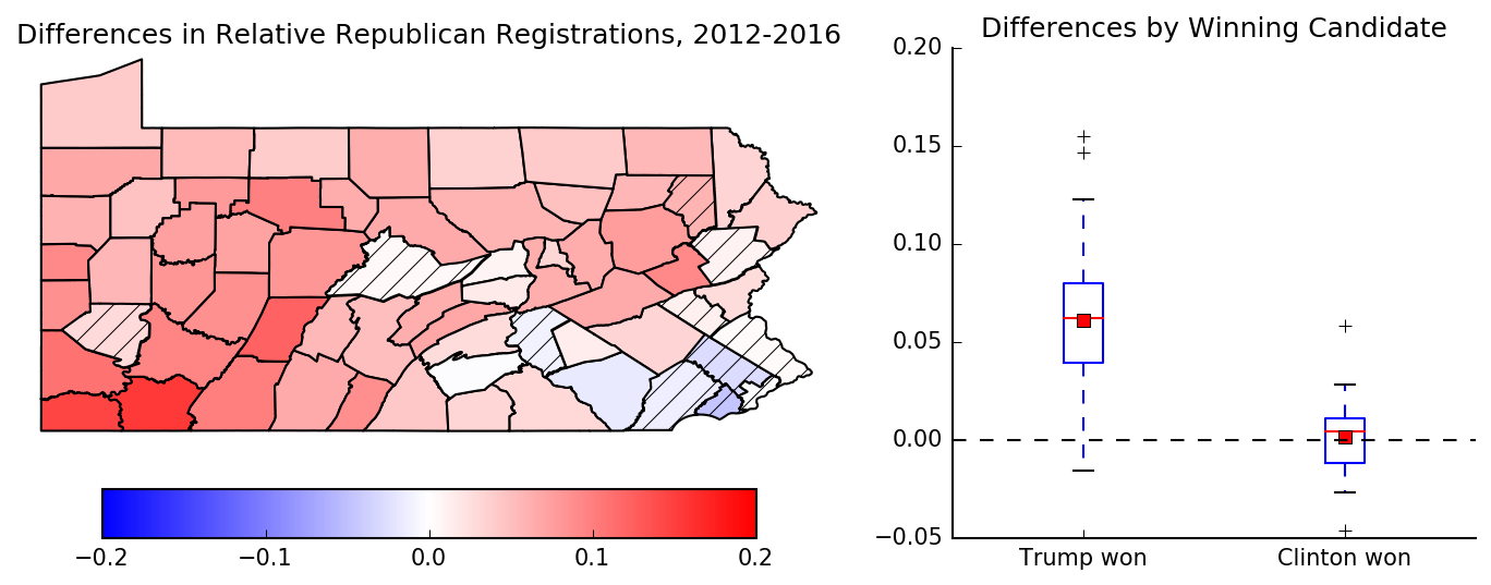
Fig 4. Map (left) and Tukey boxplots (right) of the distribution of the change in relative Republican registrations in each county between 2016 and 2012. On the map, the counties with hatches are the counties which Clinton won in 2016. For the boxplots, the counties are grouped by the winning candidate, so each county is only included in one boxplot or the other (not both).
As Figure 4 shows, counties Trump won saw an average 6% increase in relative Republican registrations over counties Clinton won. If we make the same assumption as before, these additional registered voters would have contributed approximately 160,000 extra marginal votes for Trump.
Taken together, increased Republican turnout and registrations across the state seem to account for approximately 64% of of Trump’s extra marginal votes. Of course, that assumes the two phenomena are independent. In reality increased turnout is likely related to increased net Republican registrations, and so their combined total is likely reduced (due to double-counting). Even so, it’s clear that increased Republican representation only explains a portion of Trump’s victory. Some other factors must have been at play in this election.
Independent Candidates and Disillusioned Democrats
The other common theory I’ve heard is that many Democrats were disillusioned with Clinton (including so-called “Bernie Bros”). The theory holds that these voters opted to vote for an independent candidate instead of along party lines, or simply didn’t turn out to vote at all, allowing Trump to win a historically ‘blue’ state. There are three separate phenomena to consider here.
First, we might consider the possibility of a lower turnout by Democrats. However, Figure 3 shows that voter turnout increased in nearly all counties. So it’s unlikely that more Democrats stayed home than in previous years.
Second, we consider the “flipped” counties as potential places where disillusioned Democrats had a direct impact. From Figure 1, we see that only 3 counties flipped Democrat -> Republican3. Let’s attribute those losses entirely to Democrats not voting for Clinton. Combined, these 3 counties might explain about 65,000 of the additional marginal votes Trump gained over Romney.
Finally, we can see if many Democrat voters opted to vote for independent candidates rather than Clinton in this election. If so, we should see an increase in votes cast for independent candidates in counties where Clinton received fewer votes than Obama did. This would manifest as a negative correlation in Figure 4. Note that here we are looking at changes in the percentage of votes for a particular party, not marginal votes. So a negative value here simply means a decrease in votes received when compared with 2012, but doesn’t imply anything about where those votes went.
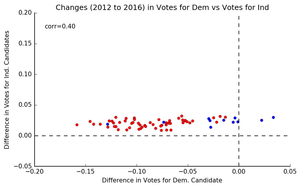
Fig 4. Plot of change from 2012 to 2016 in votes cast for: (x-axis) the Democrat candidate vs (y-axis) all independent candidates. Values are reported as a percentage of all votes cast in each county. The color of each marker indicates which party won that county in 2016.
However, Figure 4 doesn’t confirm this theory. It appears that votes for independent candidates rose around 2% in 2016 across all counties. Further, we see a slightly positive correlation. So, it appears that the opposite of what this theory predicts is observed - it is in counties where Clinton did better than Obama that we see the largest increases in the percentage of votes cast for independent candidates.
That said, let’s suppose that these additional votes for independent candidates did come exclusively from disillusioned democrats who otherwise would have voted for Clinton. Combined, that comprises approximately 140,000 additional marginal votes for Trump.
Although a popular refrain amongst Clinton-supporters in the aftermath of the election, it appears that disenfranchised Democrats didn’t help Trump as much as you might be led to believe. Taken together, their (in)actions contributed up to 48% of Trump’s extra marginal votes, and that is an upper bound.
Registered Democrats voted for Trump
There’s one last explanation for what happened - that registered Democrats decided to vote for Trump. We can’t measure this directly from the data we have; we would need exit poll data. However, when we compare the count of votes for Trump against the number of registered Republican voters, we find that in 14 of the counties Trump won (remember, he won 56 counties) there were more votes cast for Trump than registered Republicans! And that is assuming that every registered Republican in those counties voted. Even so, that adds up to at least 56,000 votes for Trump that couldn’t have come from any registered Republicans, representing at least 15% of the extra marginal votes he gained over Romney. And, given that it is unlikely turnout was 100% for republican voters, the total number of Democrats voting for Trump was likely much higher.
It’s Complicated
Trump’s win in Pennsylvania came as a surprise to me and many of my peers. The knee-jerk reaction from my liberal media bubble was that Clinton didn’t do enough and Trump got lucky. However, the truth is that Trump won 40,564 more marginal votes than Obama did in 2012 and swung more marginal votes (when compared to Romney) than Obama did in 2008 (when compared to Kerry).
Further, while we often talk about how Clinton lost the election, we tend to oversimplify the reasons. In reality, it’s far more complex than any single factor can explain. As I’ve shown, there’s evidence that more Republicans registered and voted than in 2012, the few counties he flipped helped him win, independent candidates likely didn’t affect the outcome, and many registered democrats voted for Trump. Although I tried to quantify to what extent each of these factors contributed to Trump’s victory, the more important point is that none of these alone account for Trump’s win. It was the result of a combination of these factors, likely achieved through coordinated actions by Trump’s team.
So far, I’ve only presented various theories explaining how Trump won. While discussing why he won would be equally as interesting, it’s also far more subjective and qualitative, and draws on expertise in areas of demographics and political theory that I utterly lack. So I’ll leave that discussion to others.
If you’ve enjoyed this post, be sure to check out Part 2, where I dive into the data from the previous presidential elections in Pennsylvania and try to put this election in a historical context. And, if you find an issue or want to let me know what you think of this writeup, please feel free to leave a comment below or contact me directly.
Finally, as mentioned before, all data, results and discussions pertain exclusively to presidential elections in Pennsylvania state. Someday, I’d like to extend this analysis to other states, but that’s limited by time and the availability of county-level data. If anyone wants to explore the data further themselves, I’ve made the notebook and data used available on Github. I collected the data by manually scraping and formatting government and public repositories; source links and methodology can also be found on Github.
Thanks to Karen Hao, Ryan Ko, Andrew Zukoski, Shane Leese and Lakshman Sankar for reading drafts of this.
A more rigorous approach for computing voter turnout is to use voting age population (VAP) or voting eligible population (VEP) as the denominator. VAP is readily available from the US Census, and so is a popular choice, but has many flaws, especially when comparing across states as different states place different restrictions on who is actually eligible to vote within the VAP. VEP is a fairly recent idea, and is meant to account for all the differences in states and thus be more readily comparable between them. However, it relies on data that is not always easy to find (or even public at all) at the county level, and is thus nearly impossible for me to use in this analysis. Michael McDonald has good set of posts on VAP vs VEP and their differences and why using registration is not ideal. In all honesty, the biggest flaw with using RV instead of VAP in this analysis is that I can’t separate changes in registration due to population growth/change vs political views shifting.
↩We need to make some assumption here, because it’s impossible to know the truth, as that would involve asking every single person that voted, if they voted previously and how they voted this year. Assuming all voters voted according to the same distribution is a simplifying, yet reasonable, assumption here.
↩And 1 county flipped Republican -> Democrat, counteracting the other 3 somewhat, but we’ll ignore that here.
↩